I’m really happy to announce an update of {designer} is available on CRAN! This is the first package that I’ve created that has warranted such an update, and the features included will help improve the experience of using the package.
What is {designer}?
When coming to write about this release, I realised that I never made a post on the initial release of the {designer} package (just some sporadic posts on the dying bird app), so a quick introduction to the package:
The {designer} package is a code-free solution to prototype the UI of shiny applications.
With {designer}, you can create a basic wireframe of an application within minutes, and it provides the R code necessary to reproduce the same UI. It enables both R and non-R users to come up with a concept of the layout of the UI before passing it to shiny developers to build the logic behind the application.
User Experience Improvments
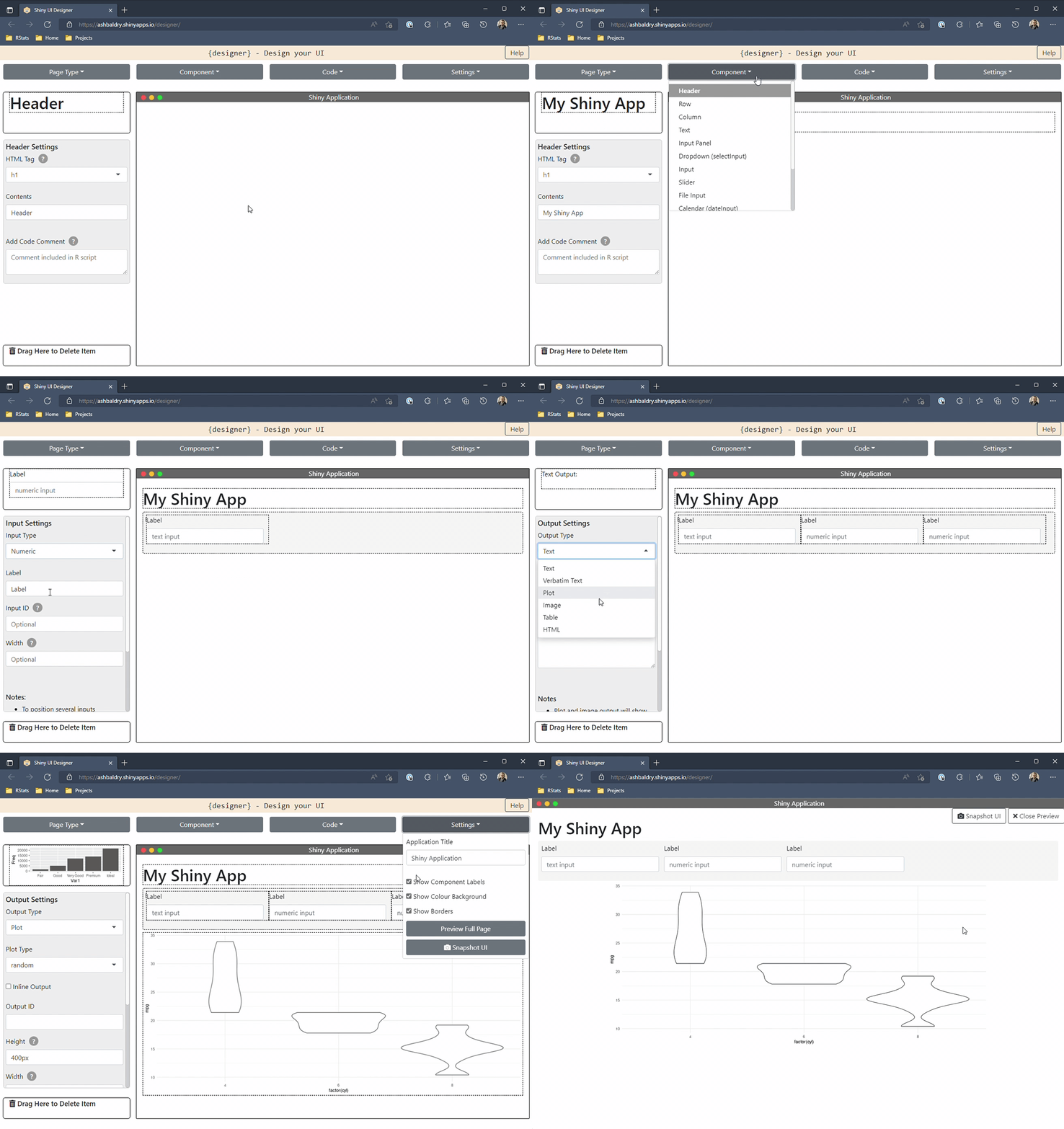
The noticeable thing when opening the application is the update to the layout; the components, rather than being a dropdown, have moved to the left of the page. This helps see from the start which components are available for the selected dashboard type, and easily switch between the components when designing.
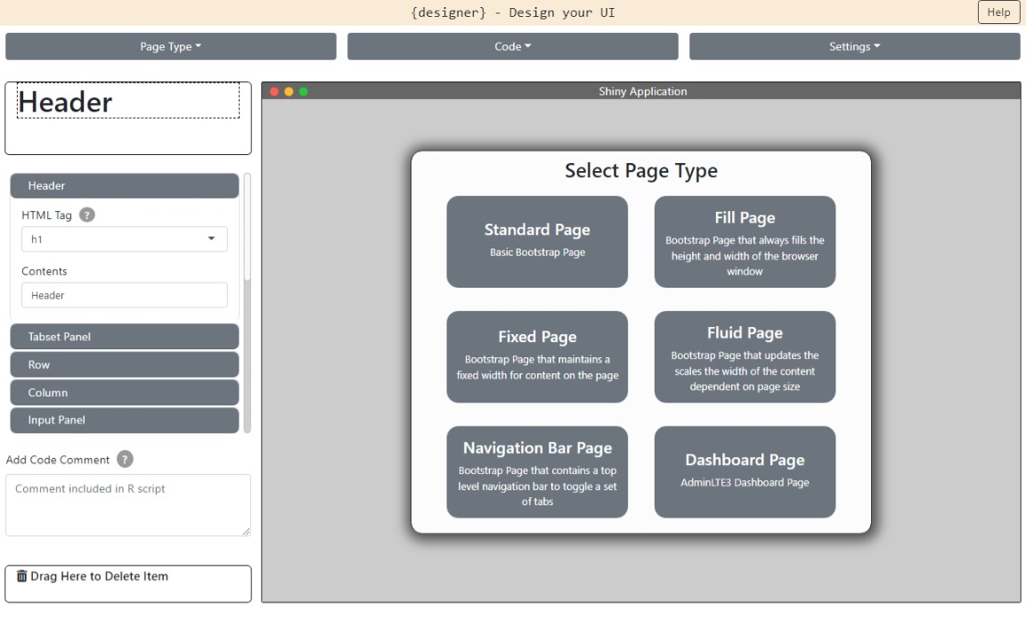
There is also the opportunity to select the page type on start-up. Previously you would have needed to select the page type dropdown and then select the page that you wanted. Additional text about each page type has been included as it isn’t always clear what the difference between a “fixed page” and a “fluid page” is.
Both of these have been implemented to also reduce the initial number of clicks required to start designing the application.
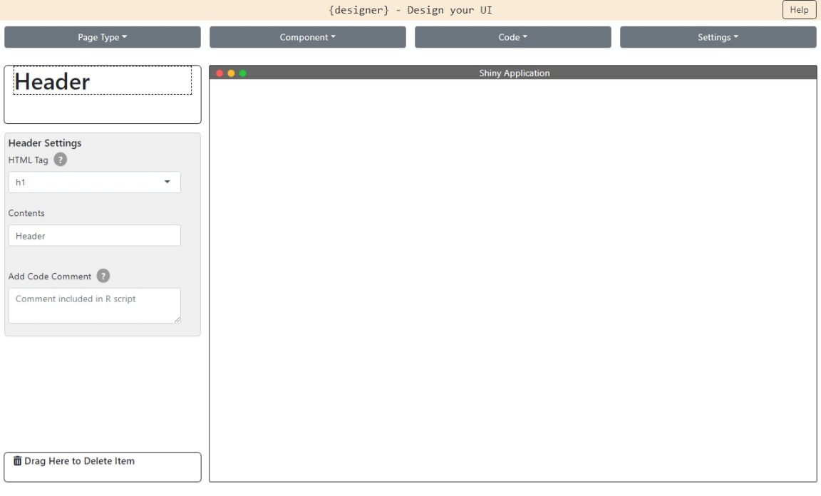
Another pain point was the deletion of elements, where you had to drag the redundant element to the “bin” at the corner of the page. This is still available, however you can now delete any element (and the children components) simply by right-clicking and selecting the delete option.
{bs4Dash} Components
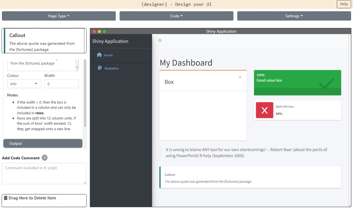
A new page type has been added to the application: the dashboardPage from {bs4Dash}. This will help provide an alternative to navbarPage for multi-tab applications.
Additionally, several components in {bs4Dash} package have been added. This includes the different types of boxes providing an easy way to show high-level values in your application, and callouts and quotes for a fancier way to show blocks of text.
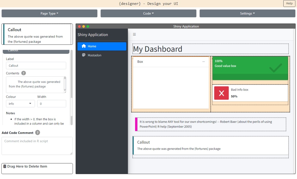
NB The {bs4Dash} components are only available with the dashboardPage as there are styling conflicts when applying these components to standard shiny page types.
Custom Styling
When creating applications with standard {shiny} components, you might want to see what it looks like with your company palette, or you want the application to not look like every other shiny application. This release includes the ability to upload a custom CSS file that can be applied to the wireframe.
There are packages such as {bslib} and {fresh} that help create CSS files that can dramatically change the look of shiny applications. Once you have a theme you are happy with, save the CSS and upload to the application, and see the wireframe update to your own personal theme.
Sharing Templates
You can now share wireframes you create using {designer}! If the application is hosted on a server then with one click you can store the state of your most recent wireframe and share with others (Thanks to Sam Parmer for making it possible to host the application with Docker). This should make it quicker to produce wireframes in the future.
There are a few limitations with how the storing is implemented (such as having to save new bookmarks each time the wireframe is updated), however there are plans to make the process of saving and sharing a lot more seamless.
Under the Hood
The amount of JavaScript in this application has become unmaintainable in its previous state of sourcing 3 scripts, so the code has been moved into a separate sub-directory. This has enabled the use of the JavaScript library esbuild to bundle up all of the code into a single, convenient, minified JavaScript file. Using esbuild has meant in one click all of the JavaScript code has been built, minified, and sent to the “www” folder, and all in under 1 second.
By having a better project structure for the JavaScript code, it is a lot easier to develop new features such as adding the {bs4Dash} components. Each component has its own individual class (and file), and by using class inheritance there is a generic Component class that can provide common functionality across all individual component classes. It has also meant I can keep internal functions for a particular part of the application in a self-contained script, and not worry about naming clashes with other scripts (similar to how internal functions in R packages do not affect globally available functions).
Thanks to everyone who has provided feedback, it has been greatly appreciated, and reflected in some of the features in this release. If you do have any thoughts on improvements, feel free to leave an issue on GitHub. The application is also available to try on shinyapps.io.
For more great examples of R in action, check out R-bloggers